Scout.AI is an innovative AI-powered recruiting tool designed to streamline the hiring process for businesses.
Hit the “Prototype” button to walk through Scout.AI
OVERVIEW
PROJECT BRIEF.
To create an AI-driven recruitment platform designed to streamline the hiring process for recruiters by providing key insights and automation tools that simplify candidate selection and reduce repetitive tasks.
DISCOVERY
GENERATIVE RESEARCH.
To kick off the design process for Scout.AI, I began with a generative research phase aimed at understanding the core challenges recruiters face in their day-to-day workflow. This broad exploration helped me pinpoint recurring themes that consistently surfaced as pain points, which informed the direction of my design.
PAIN POINT #1
Lack of Organization
Rozario, Sophia Diana, Sitalakshmi Venkatraman, and Adil Abbas. 2019. "Challenges in Recruitment and Selection Process: An Empirical Study" Challenges 10, no. 2: 35. https://doi.org/10.3390/challe10020035
PAIN POINT #2
Hiring pace strains time management
Mercken, S. (2013). IT recruiting: Obstructions and opportunities. Ghent University. https://libstore.ugent.be/fulltxt/RUG01/002/162/840/RUG01-002162840_2014_0001_AC.pdf
PAIN POINT #3
Lack of Resources
Lim, L., Wang, Y., Hoshino, Y., & Islam, M. N. (2015). Unveiling the Mysteries of the “Black Hole” in Recruiting Systems: Connecting Recruiters and Job Seekers Like a Jigsaw Puzzle. Procedia Manufacturing, 3, 3470–3477. https://doi.org/10.1016/j.promfg.2015.07.652
USER INTERVIEWS / PERSONAS.
After identifying these pain points, I conducted in-depth interviews with a sample of 15 recruiters to better understand their workflows and challenges. Using the script below, I explored how these pain points manifest in their daily tasks and gathered insights to inform my design solutions.
User Interview Script:
What are the biggest obstacles to your workflow?
How much time is dedicated to reading through resumes?
Do they often carry a lot of substantial differences that make that time worth it?
How do you keep track of candidates you’re evaluating?
What do you consult when hiring for a job that has specifications out of your expertise?
Using the insights and data collected from the interviews, I synthesized the findings into two distinct user personas that represent the primary needs and behaviors of recruiters.
IDEATION
LOW FIDELITY.
With insights from my generative research and user interviews, I translated the key pain points into targeted solutions, showcased in the initial low-fidelity sketches to establish the foundation for a more efficient recruiting workflow.
01. Landing_Page
When building the dashboard, I leaned toward a bento box layout to make the wide range of tools feel more approachable and accessible
In developing the hiring portal, I prioritized positioning the AI chat bar prominently at the center of the interface for ease of access.
In designing the website’s layout, I aimed to reflect the spacious, streamlined aesthetic common in corporate websites, drawing from minimalist principles to achieve clean, balanced spacing throughout.
For the landing page content, I focused on incorporating impactful statistics to build trust and credibility, aligning with the expectations of a B2B audience.
02. Dashboard_Page
Recruiters need immediate access to their deadlines and progress, along with the right tools to make informed decisions. To address this, I created dedicated sections for tracking upcoming deadlines and job posting progress, alongside tools that evaluate candidate fit, such as matching learning styles to work environments, an AI tool for crafting compelling job postings, and a database of previously considered candidates who may be suitable for specific roles.
To explore how best to prioritize these features, I experimented with two layouts: Layout A, which emphasized the deadlines and progress windows, and Layout B, which focused on the tools windows. I conducted A/B testing with the recruiters I interviewed to determine which layout would best capture their immediate attention and meet their needs.
80% of participants expressed a preference for Layout B.
I believe this preference stems from the positive effects of the F-shaped visual hierarchy; many participants emphasized the significance of the information at the bottom of the layout, which aided them in making informed decisions about which options at the top they were already hovering over.
03. Hiring_Portal
For specific job pages, I identified these card presets to optimize workflow: the newest candidates, the AI-ranked best fit list, and the learning style match (criteria organized by the AI).
I created filters designed to refine specific priorities required by the client for the role, streamlining and enhancing the search process.
This solution directly addresses the challenge of the User Persona (Junior)’s goal of finding better ways to organize and track candidate data.
I created convenient, readily accessible buttons for recruiters to sort candidates by best fit, save candidates for future consideration, or draft an email directly to a candidate.
This solution directly addresses the challenge of the User Persona (Junior)’s pain point of forgetting specific details about candidates unless they are noted down immediately. and often overwhelmed with keeping track of candidates manually through spreadsheets and ATS.
Brand Identity.
In creating the brand identity for Scout.AI, I chose the Nohemi font, a green-and-yellow palette with an off-black accent, to convey a polished, professional look suited for B2B. Through experimenting with various color combinations, I landed on these for their universal and approachable tone. To enhance usability, I implemented a glassmorphism aesthetic alongside a bento box layout, giving the UI a modern, streamlined feel that’s both visually appealing and highly accessible for users.
This solution directly addresses the challenge of the User Persona (Senior)’s pain point of having to manually compares candidate qualifications, which slows down her productivity.
DESIGN
HIGH FIDELITY.
With the groundwork laid and a strong brand identity in place, I'm excited to bring my solutions to life in high-fidelity screens that highlight the product's vision. In this section, I introduce the approach to building Scout.AI’s brand identity, beginning with the landing page as a foundational template that would guide the design across the entire product.
01. Landing_Page
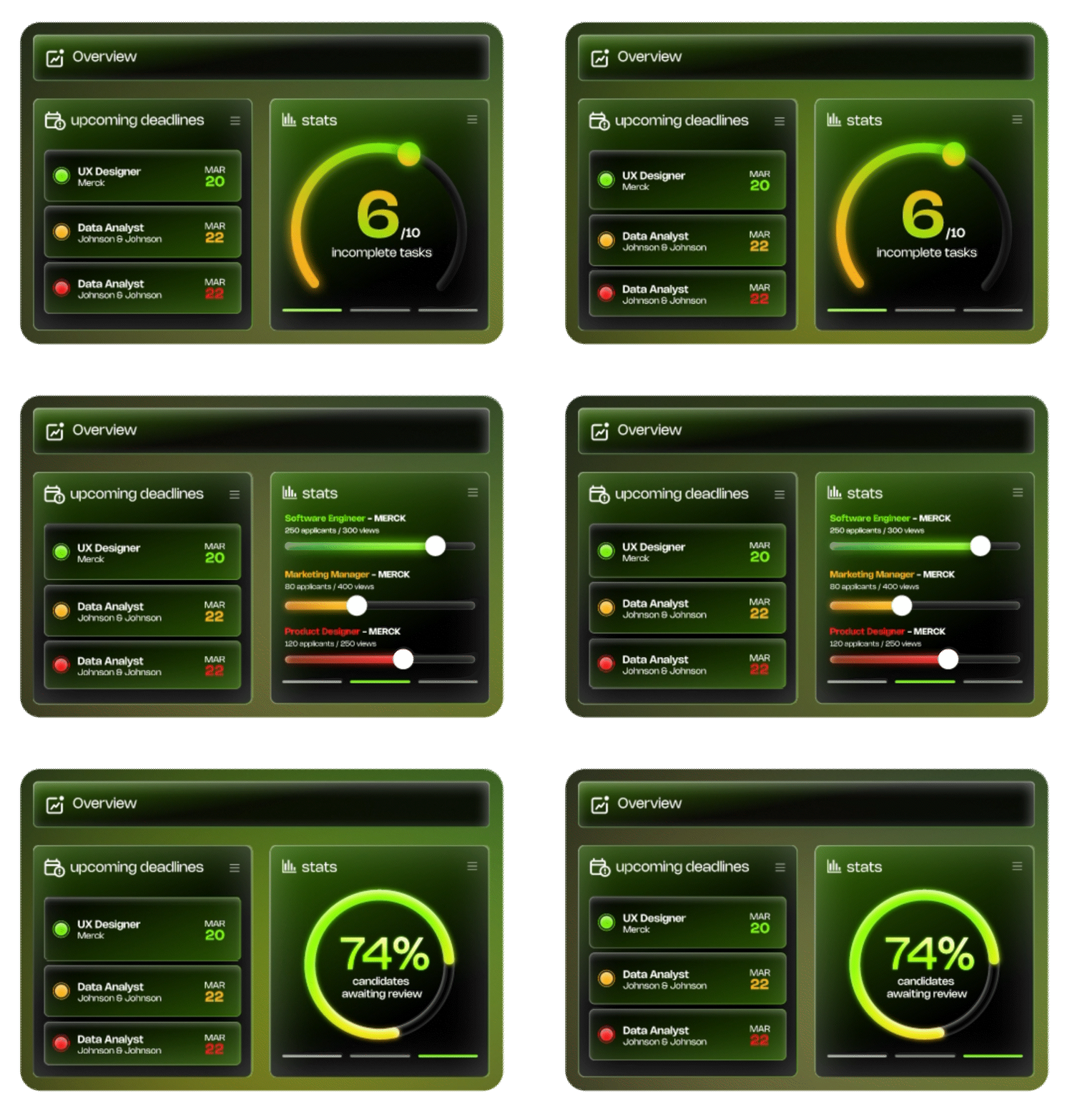
To achieve a look that balances cutting-edge sophistication in the B2B market, I adopted the glassmorphism style, evoking both futuristic appeal and a professional aesthetic.
Additionally, I incorporated animated transparency cycles for key statistics to emphasize each metric, helping to guide viewer focus
02. Dashboard_Page
Each tool’s icon was given a subtle hover animation, balancing visual interest without distraction.
To ensure deadlines were emphasized, I animated a subtle expanding animation of the nearest deadlines
03. Hiring_Portal
In designing the job-specific hiring screen, I structured a clear text hierarchy to support Nielsen’s heuristic of system status visibility to ensure the user will never get lost no matter how deep they click into the product.
For the AI search bar, I added a complementary idle animation featuring Scout.AI’s logo to create brand consistency.
To help recruiters quickly differentiate candidates, I implemented color-coded filters that emphasize relevant matches.
Additionally, I developed a section where the AI summarizes resumes and cover letters, displaying graphical statistics of candidates' potential strengths to enhance decision-making.
TESTING
user testing.
To ensure my product met the needs of recruiters, I conducted usability testing with 10 participants, analyzed their feedback, and identified three key areas for improvement that informed targeted solutions.
The Dashboard
Feedback #1
For the dashboard, while many participants responded positively to the chosen layout, a portion preferred prioritizing deadlines in the first row instead of tools.
To address this, I added a drag-and-customize icon in the top-right corner, allowing recruiters to adjust the layout based on their preferences and create a more personalized experience.
Feedback #2
Card Presets
Another piece of feedback I received highlighted concerns about the overwhelming amount of information presented on the specific job hiring page, particularly with the card presets for “Best Fit” and “Learning Style Match.”
Some participants were confused about how to retrieve “Love” and “Save for Later” selections when expanding a candidate’s pane, contributing to information overload.
To address this, I identified two distinct issues and implemented a single solution: the “Best Fit” and “Learning Style Match” features are better fit as additional categories for filters, while the “Love” and “Save for Later” options were prioritized as card presets. This adjustment offers recruiters a clearer decision-making process and a more intuitive introduction to the available tools, reducing confusion and improving usability.
Feedback #3
Recent Searches
While not a flaw, some participants suggested adding a "Recent Searches" tab to streamline their workflow by allowing quick access to lists and tasks from their previous working session.
REFLECTION
CONCLUDING THOUGHTS.
Reflecting on this project, I’ve been able to navigate through a range of design solutions, from initial research and user interviews to usability testing and implementation of brand identity. Creating an AI-assisted recruiting tool challenged me to evaluate various layouts and functionality, ultimately aiming to simplify a complex process for B2B users. The experience allowed me to dive into a unique market audience and refine a distinct design style that aligns with the needs of modern recruiters.
I’m proud of what I’ve accomplished and excited to keep building on this foundation as I explore further improvements.


