Woof Woof Welfare is a non-profit organization whose mission is to help dogs in shelters get adopted and help dogs living with humans stay together. I was responsible for re-designing the UX and UI of a mobile website.
Hit the “Prototype” button to walk through Woof Woof Welfare
The nonprofit’s original name was “CAAWT” and this was their mobile website
I was tasked to redesign.
(“Constructional Approach to Animal Welfare and Training” for short)

The 3 parts of the website I focused on were:
LANDING PAGE.
DISCOVERY
UX/UI Pain points.
While UX and UI are two different, they carry a shared responsibility in being able to immerse new users. A lack of consistency is going to lead to the user feeling overwhelmed and lost.
Consistency communicates navigability.
an elevator pitch to new donors.
The statement at the top of the website is brief and lacks enough detail to inform the audience about the issue this non profit it is tackling and the work the non profit has conducted to earn your donation.
The max lines people will read are 3 lines, and it’s not helpful for users to skim and absorb. It’s all text with no visuals to reinforce their understandings.
too much text.
Visuals are not the most identifiable that this is for dogs’ welfare and the ”Donate” button is not immediately present
SCATTERED
color palette.
There are 8 different colors in the palette with no consistent relationship in the color psychology
IDEATION
VISUAL SOLUTIONS.
While UX and UI are two different, they carry a shared responsibility in being able to immerse new users. A lack of consistency is going to lead to the user feeling overwhelmed and lost.
Prioritized the “Donate” button on the landing page paired with a more prominent dog photo
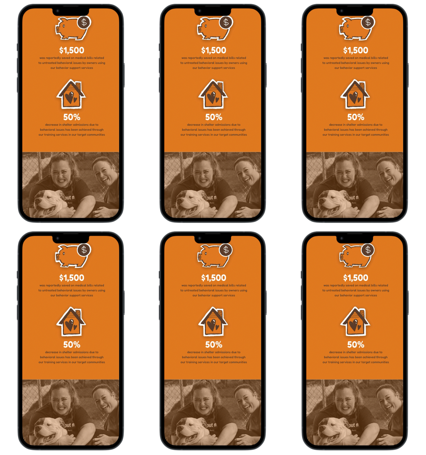
Integrated statistics to help showcase the issue and our impact
Created a text hierarchy that’s complemented by icons and contrast in the sizing of text to emphasize statistic
brand identity.
With the goal being to secure more donations, I needed to create brand identity with a consistent color palette to evoke the desired emotional response.
A study “indicated that even the physical comfort such as weather conditions affects people’s money donation possibilities” (Maleki 2020)
This part of my generative research motivated the yellow, brown, and orange palette (as opposed to the low contrast light blue) to emulate a warmer tone to incentivize donation.
References:
Maleki, F., & Hosseini, S. M. (2020). Charity donation intention via m-payment apps: donor-related, m-payment system-related, or charity brand-related factors, which one is overkill? International Review on Public and Nonprofit Marketing. https://doi.org/10.1007/s12208-020-00254-3
DESIGN
IMPLEMENTATION.
I created hand drawn illustrations with an idle animation to make the information more digestable
Created clearer and concise sentences, complemented with relevant visuals of dogs
NAV BAR.
DISCOVERY
CONTENT AUDIT.
I conducted a content audit and sitemapped the entire website to evaluate the navigation bar’s organization and ease of use
CAAWT’s Original Hamburger Menu
In sitemapping out the content of the nav bar options, I counted
8 Categories IN TOTAL.
8 categories to choose from is going to overwhelm any new viewer, and discourages them from feeling like they can get a full understanding of the non profit’s work and reliability.
IDEATION
SITEMAP REORG.
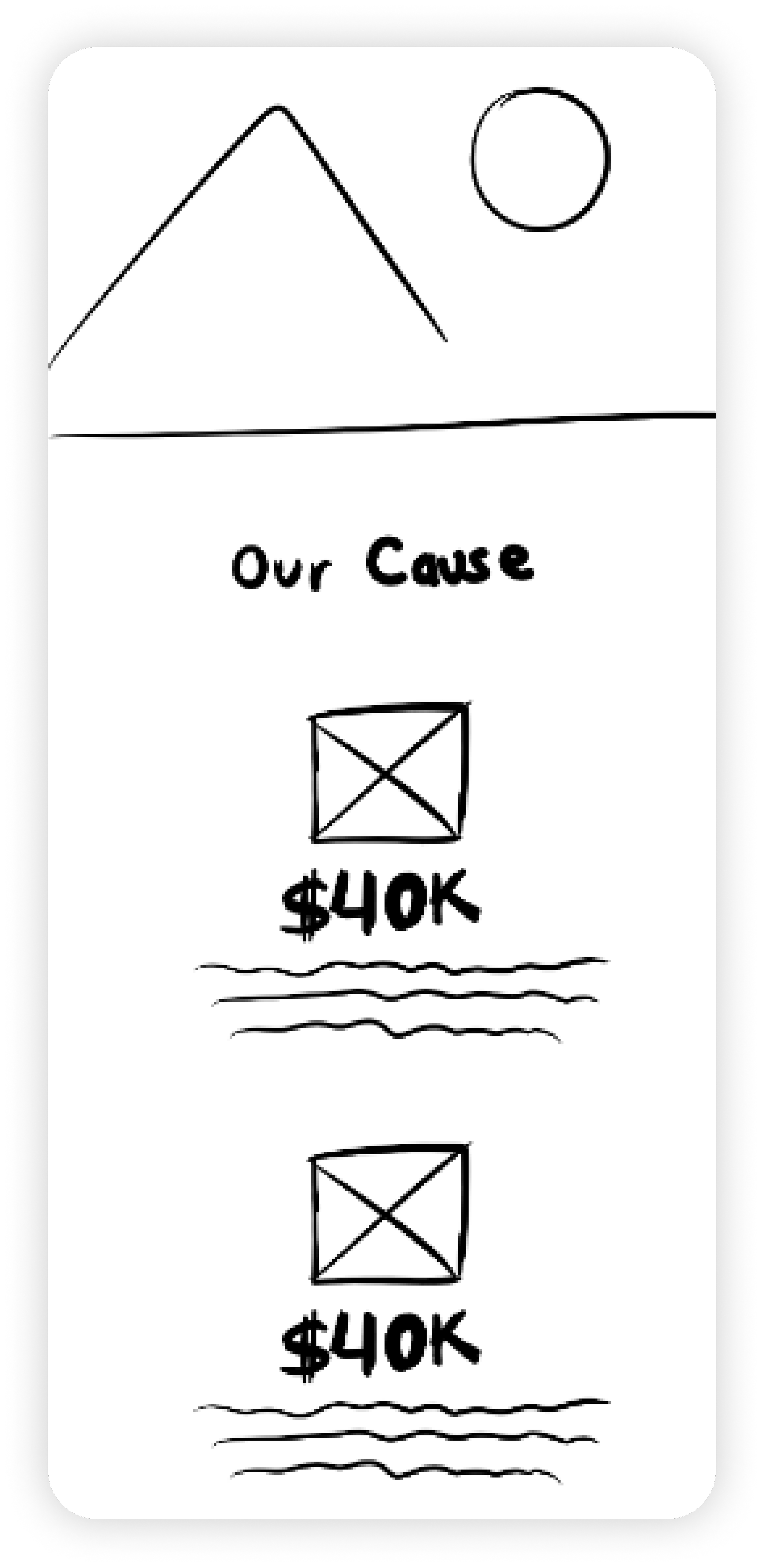
To streamlined navigation to the content, I condensed the 8 navigation categories down to 4 and implemented it into a low fidelity design.
DESIGN
IMPLEMENTATION.
The “Donate” button is far more distinguishable and accessible than before
DONATION PAGE.
DISCOVERY
comparative analysis.
To ensure the UX of the donation process was strong, I conducted a Plus Delta Evaluation of other non-profit’s donation pages.
ORIGINAL WEBSITE
There are a lot frequent questions addressed about secure donation that instills trust in the user
Content is very wordy (users can forget why they’re donating in the first place)
UNICEF WEBSITE
The donation page’s white design feels disconnected from the original website’s black design - potentially causing user anxiety about the donation's legitimacy
Centralized on one page
(easy navigation)
WWF WEBSITE
Not many visuals, it’s just text and input fields (it could contribute to user drop-offs)
Allows you to select thank you gift (more control given to user)
IDEATION
MOTIVATING DONORS.
The comparative analysis gave me a strong foundation to think through a few solutions to make the donation process an enticing and seamless experience.
I made the donation section into one consistent/spatially centered card that maintains the focal point, so the audience doesn’t feel disoriented inputting their information
I made the donation increments $4 / $7 / $9
In my generative research, a study indicated that default amounts like “4, 7, 9” are perceived as more affordable compared to those ending in “0” or “5” (Schulte 2021).
The comparative analysis showed me that some websites allow you to choose your own thank you gift.
Choice and specificity is integral in any financial experience, hence I created a section that allows the user to channel your specific donation to whichever cause / specific operation they deem the most important.
To further motivate donor behavior, I also created a section in another part of the website that shows an active donation progress bar, to highlight the milestones
DESIGN
IMPLEMENTATION.
To offer a sense of progress to the donation process, I placed an orange progress bar that divides the information areas and the photo of the dogs
When creating the donation progress bars, I gave each cause unique badge icons that would appear next to user profiles in the comments section if users have donated to the cause
REFLECTION.
REFLECTION
CONCLUDING THOUGHTS.
My work with Woof Woof Welfare is far from complete, but I’m proud of the progress I’ve made in collecting and integrating data into my designs to create stronger incentives for both new and continuing donors. This project has been an opportunity to
help the nonprofit highlight its mission and impact more effectively.
Moving forward, I aim to conduct several rounds of usability studies to refine these designs and further strengthen the nonprofit’s ability to connect with its audience and expand its reach. I’m excited to continue using design as a tool to make a meaningful difference in the nonprofit sector.


